Monday, December 3, 2012

Book 'Em, Danno

     It's beginning to look a lot like Christmas, and you know what that means. Fires in the fireplace. Choirs in the choir-place. And, printers sending customized swag to the agency.
     A few days ago, B Direct's Senior Art Director received not one but two personalized datebooks. The packages were similar. An oversized window envelope:


A personalized long-format letter that included an order form:


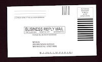
A prepaid business reply envelope:


And ... the piece de resistance freemium gift item, a genuine personalized datebook:


     The package above was sent by a company called Myron. It's certainly competent and observes a lot of direct mail best practices, even including some printed FAQs on the back of the letter (a nice way, perhaps, to avoid some incoming telephone calls):


     At B Direct, we are not in the market for personalized datebooks, but there's no reason we wouldn't order them from Myron if we were.
     On the other hand, the package that arrived the same day from Myron's competitor Amsterdam contained a fatal flaw. It too had a window OE, a letter with reply slip, a BRE. But, the datebook was personalized incorrectly:


The agency is imprinted as:

B DIRECT MARKETING
COMMNCTIONS

Clearly, Amsterdam purchased the agency's name from some list that uses a fairly awkward abbreviation for the word "Communications." Ouch.
     What is the most precious word in any language?  A person's name. What is an almost equally valuable word to a business owner? The company's name. These are important details to get right.
     If you're going to do creative VDP (variable data print) personalization, please make sure you have the recipient's name spelled correctly.
     If you're going to invest in customized incentive items, be sure that the company's name is correct — and complete — in your list.
     The b's at B Direct give Myron a thumbs-up ... and Amsterdam a thumbs-down.


Tuesday, October 23, 2012

It's Hard to Resist Don Draper

     From day one, AMC has used social media and viral marketing to help spread the word about its critically acclaimed series Mad Men. From avatars to apps, quizzes and cast Q&As, there have been seemingly countless ways to engage with the mad men and women of Sterling Cooper (now, Sterling Draper Cooper Pryce).
     Real-life ad agency days aren't quite as stylish, sexy or carcinogenic. So, we were thrilled to receive an email today with the subject:

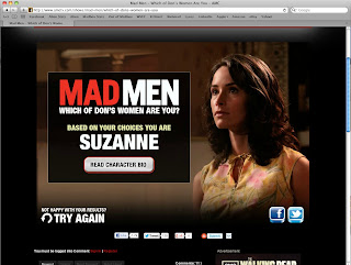
Mad Men | Which of Don's Women are You?

     How could we resist?


     The body of the email, complete with a dashing photo of Mr. D and all of his conquests, invited us to click through. Love the second part of the headline: "Answer Just Seven Questions and Find Out!" Great way to encourage participation. Sure, you may be reading this while you're at work, but you can take a break for seven little questions.
     The quiz is quick and fun, humorously written and reminiscent of the show. (Oh, and for the record, the Queen B is a Suzanne.) Once, you have your results, you're invited to play again or to share via Facebook or Twitter.


     Mad Men doesn't start up again until after the holidays. But, engaging promotions like this one keep it top of mind for all of the (opt-in) "maddicts" out there. It's also a great way to promote AMC's other products.
     The b's at B Direct give this email campaign a thumbs-up. Or, we would if our hands weren't already full of martinis and cigarettes.

Wednesday, October 17, 2012

One Small Package, So Many Things Right

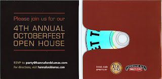
     "Prost!" It's Octoberfest time, and the b's just received invitations to a party at Hannaford & Dumas, a Boston-area printshop. These neat square mailers arrived last week. Each just 5" x 5" in size but packing a lot of promotional punch.


     With all of the invitation information on the outside, one might worry that the package wouldn't be opened. No worries. We could tell that there was something inside the sleek little piece and our curiosity was piqued.


     Sure enough, along with RSVP information, we found a CD.


     These folks did so many things right, it's easier to list them than to write full paragraphs:

• Square package stands out
• Typography-based graphic reads "cool" to art director audience
• Stamps.com stickers beat pre-printed indicia (although a traditional USPS stamp might have been better)
• Copy is super quick — just the facts, ma'am
• Sending a CD adds "freemium" excitement
• Letting us know right on the disk that it's only "about 2 minutes" is very smart
• Video is clean, quick and persuasive
• And, an Octoberfest party is so much more appealing than a press tour

     Well done, Hannaford & Dumas. The b's at B Direct not only give this invitation a thumbs-up, but we are going to consider you the next time we have an appropriate print project. "Zum Wohl!"

Tuesday, October 9, 2012

Get the Picture ... or Not

     At B Direct, we get a lot of direct mail inviting us to various area galleries, openings and artists' receptions. This week was no different. This oversized postcard arrived from the Art Institute of Boston, a local school that we have supported for years.
     

     The front (or art side) of the card had a bright blue field of color with all the logistics we needed: exhibit dates, reception information and the theme. It was the school's Centennial Faculty Exhibit. We flipped the card over and found more of the same with the addition of the gallery's address and phone number.


     Um ... something was missing. Can you guess what?
     This is an invitation to a photography exhibit. So, where is the photography? Dudes, you are promoting an event that is all about images. Where are the images?
     At B Direct, a lot of our clients are marketing invisible products like data storage. Even so, we make it a point to include some pictures. People look at pictures first. And, we're guessing that there are probably some pretty fantastic pictures that could have been used to market this event. What a waste.
     Sorry, but the b's at B Direct are going to give this one a thumbs-down. (Get the picture?)

Monday, August 27, 2012

Artistic Direct Mail

     When we design direct mail packages for clients, we often try to come up with something that the recipient will hold onto. We can do this through creative personalization, by including something informative or useful, or simply by coming up with a format that is so cool the person who receives it simply can't throw it away.
     A few days ago, the Queen B received a smart little package that is still sitting on her desk. Here's what it looks like:


     The outer envelope is fairly straightforward. It comes from the Tufts Art Gallery and a teaser along the bottom alerts that the package contains an invitation to a September 11th event. A quick note on the placement of the teaser: you can see that a USPS bar code is interfering with the artwork. Putting the message above or along the left hand side of the address would have avoided this. 
     However, this is a minor grievance when followed up with the abundance of colorful content we discovered inside:


     A bright yellow belly band contained four cards, each depicting the work of a particular artist featured in the gallery event.


     The backs of the cards gave quick biographical statements and, again, encouraged our attendance at the opening event. Each felt like a miniature work of art, and the overall effect was, well ... effective. Having experienced a taste of the upcoming exhibit, we were definitely intrigued to learn more.
     Best of all, four days later, the cards still haven't been thrown out. And, the event is written, in ink, on the Queen B's calendar.
     Our only other bit of constructive criticism (aside from the observation about the teaser placement on the envelope) is that the piece would have benefitted from a reply device. A simple one- or two-color additional insert could have accomplished multiple things: collected email addresses, provided a URL for additional information, served as an event reminder to slip into a wallet or pocket, offered driving directions or coordinates for a GPS.
     Overall, however, the art enthusiast b's at B Direct give this direct mail work of art a big thumbs-up!

Friday, August 3, 2012

To Fee or Not to Fee

   We clicked on an Aer Lingus banner ad this afternoon that promised us low fares to London. 


     It brought us to a web page that listed sample fares from Boston, Chicago and New York.


     The fares did look pretty good (not cheap, by any means, but easily half the going rate these days). But something else caught our eye:


In the upper right of the page, Aer Lingus was promoting its "Total Pricing" policy. It promised "No surprises" and that "Our fares now include all taxes & fees." We liked this idea! Too often, you select a fare only to find that the actual price you pay is tens or even hundreds more when airport fees and taxes are included.
     Imagine our surprise then when we scrolled down and found the following disclaimer copy:


     Since you may not be able to read the screen grab, here's what we learned:


* Terms & Conditions

Fares are per person, round-trip including carrier and government imposed fees and taxes including the September 11th Security Fee of $2.50 per enplanement originating at a U.S. airport. Fluctuations in exchange rates may affect some taxes and fees.
Additional Fees:
Fares are an additional $20 each way when traveling Friday through Sunday. There is an additional $20-$40 each way surcharge for fares purchased at an Aer Lingus airport ticket counter or through (800) IRISH-AIR.

    So, apparently their "No surprises" policy is only good four out of seven days a week. Too bad. The $2.50 fee that's included is considerably less than the $20-$40 fee that is not. Bit o' bait and switch, mate?
     If you can really (really, really, we mean really) live up to a "No Hidden Fees" policy, by all means do promote it. If you can't, then by all means ... don't. Thumbs-down from the b's at B Direct I'm afraid.

Thursday, August 2, 2012

Too Too Much

     We often design oversized postcards for clients. They stand out; they provide enough real estate for branding, copy and offers. Bigger can be better, but this oversized (8.5 x 11") postcard showed up today, and it is just too much!


     Help! Where do you look first? On the so-called "art side" of this postcard, we have an image and a headline and a subhead and some copy and a subhead and a bulleted list and a subhead and some copy and a screen grab and a URL. Lions and tigers and bears, oh my!
     The image of the mother and baby is compelling. But, the recipient doesn't get a moment to look at it with all the other material crying for attention.
     The back or address side of the postcard is also overcrowded:


     The coupons are a good idea, but they would be more convenient (easier to tear off) if they ran along the bottom or a side edge. The bulleted copy is the same as the bulleted copy on the front of the card.
     Clearly, the creative team, the client or both come from the school of "We're paying for the paper anyway, why waste it on white space?" Here's a few reasons: it's easier on the eye, it makes your content stand out; it helps ensure the space that isn't white gets read.
     The b's at B Direct give this big fat card a bit fat thumbs-down. Sorry. There's just too much there there.

Friday, July 27, 2012

Postcards from the Edge

     "Email is king. direct mail is dead." Yeah, yeah. And video killed the radio star. Email has certainly become ubiquitous. And, used strategically, it can be cost-efficient and effective. But, direct mail is still pretty powerful stuff. Especially today when there is so much less paper mail in everyone's in-box.
     Looks like we're not the only ones who still believe in direct mail. We were happy to see not one, not two, but five oversized postcards come in on the same day.
     From an online printer:


     From a community college:


     From two different museums:


     And a local bank:


     At B Direct, we're big big fans of big big postcards. They are quick, they can be bold and brand-building. They're a great way to present a strong offer. They can utilize high-impact digital personalization (which also leads to prospect retention of the card itself). They are portable. They can be passed along. We think of them as mini posters, as little billboards delivered to your door.
     When your mailbox is filled with invoices and bills, it's nice to see some pretty pictures. The b's at B Direct are giving these marketers a thumbs-up for going old school.

Monday, July 16, 2012

Life's Little Luxuries

     These days, we get plenty of not-for-profit solicitations. And it's no wonder. When the economy is down, people have less (or perceive that they have less) to give. Sadly, when the economy is down, there are more people in need.
     Most of the direct mail we get in this category uses emotional images of impoverished families or hungry children. That's why this very straightforward #10 from Oxfam America caught us by surprise.


     The outside envelope features a two-part teaser. On the mail side, it reads: Everyone deserves life's "little luxuries" ... Then, on the back of the envelope, it continues the thought: you know ... like food, water, that kind of thing.


     This message made us stop and think before we even opened the piece. More importantly, it made us compare and contrast our own definition of "life's little luxuries" (how about a $5.00 Frappuccino, anyone?) to other more critical things we take for granted.
     Inside, the four-page letter (two two-sided sheets) started strong: Our parents were right — life isn't fair. Simple things that you and I can count on every day are luxuries to the world's most vulnerable people.


     Throughout the package, there was nary a hungry child in sight. Instead, we had elegant copy with several examples of how Oxfam America helps individuals and communities. The response slip was also straightforward with a headline that brought us back to the intriguing idea that got us to open the envelope in the first place.


     Many marketers today will tell you that long-form copy no longer works. That people don't have the time (or, let's face it, the attention span) to read this much. We would love to know how this piece did. And, what a great package to test against a similar message with colorful photography and graphics. The piece is clean, compelling, cost-efficient. And, the b's at B Direct give it a thumbs-up.

Tuesday, June 19, 2012

Monster Mash

     Is the economy finally turning around? The postcard we received today from mega employment portal Monster.com certainly sounds promising. It's been a buyer's market for quite a while, but Monster uses the tried-and-true direct marketing technique FUD (fear, uncertainty, doubt) to make us worry that our next great hire is already being hired by somebody else.


     Bravo to the Art Director — bright, bold, hard to miss. The postcard looks like a little billboard that ended up in our mailbox.
     On the mail/message side, the question is paid off with the simple promise: "Find them first, and fast, at Monster." We are offered a "BOGO" (buy one, get one) incentive. The copy is fast and particularly easy-to-read with bullets and plenty of white space. So, Bravo to the Copywriter too.


     Last but not least, we're given not one, not two, but three ways to respond: campaign URL, toll-free number and QR code. 
     It's lean, it's mean and it does the job. The b's at B Direct give this hard-working postcard a thumbs-up. Now ... if only we were hiring.

Wednesday, June 6, 2012

Mixing Metaphors

     This postcard arrived at the agency yesterday. A nice, oversized full-color card with a stock image that stood out and definitely expressed the rush we all feel in today's fast-paced, global market. The headline read: "Time is of the essence." So far, so good.


     Here's the copy we found when we flipped it over:


Our technology allows you to be efficient and effective. Experience the feeling of printing smarter. After all, our objective is to simplify your job.


With Franklin Printing piece (sic) of mind is part of the process. So go on - set the world on fire. We've got your back.


     It then listed our account rep's name, cell and email.


     Yikes! Where to begin? Clearly, there are a number of benefits to working with Franklin Printing. But, they hooked us with a "time" message on the art side of the card. Why not stay with that theme? Or, at the very least, give us a verbal cue that they are moving onto other messages. Within one short paragraph, we are bombarded with selling points: (1) efficient and effective, (2) printing smarter, (3) simplified job. In the next paragraph, we get not one but three metaphoric ideas: (1) "piece" of mind, (2) setting the world on fire, and (3) "we've got your back."
     Guys, nice concept, but the copy just doesn't follow through. Next time, stick to one big idea. And, be careful with the typos, please. 
     Yes, "time is of the essence." But, so is accuracy and a crisp, clean message. The b's at B Direct have to give this one a thumbs-down.
Wednesday, May 30, 2012

Enough About Us, What Do You Think of Us?

     At B Direct, we do plenty of email marketing. It's fast, it's inexpensive. Sent to the right audience with the right creative and the right offer, it can be very effective. 
     We recently received an email solicitation from Opal Financial Group, the self-described "leading organization in coordinating premier financial conferences globally."


     It appears that we are being invited to attend a financial conference. In the banner of the email, set up as a Q&A, Opal explains "Who attends ..." with a list of potential types of attendees. Well, we're sorry to report that we are not a Family Office, Money Manager, Private Equity Manager, Hedge Fund Manager or Pension Fund Manager. Sadly, after the agency's first decade, we are not High-Net-Worth individuals either. (Not yet at any rate.) So, this particular email was not sent to the right audience. Strike one.
     In terms of creative, the email breaks a cardinal rule of direct marketing copy. Where, oh where, is the magic word "You?" 
     You appears — only twice — in the call-to-action: You can also visit www.opalgroup.net, and in the opt-out disclaimer: If you would prefer not to receive any further emails from Opal, please click here. Meanwhile, the email uses an awful lot of real estate promoting the company. The copy doesn't explain the benefits of attending these events. But, that's probably okay because the list of events, appearing in dark grey type on a brown background, is practically impossible to read. Creative? Strike two.
     Which leaves us with the offer. The email gives us two choices: Register Now and Information Request. Both drive us right to a form. Unless we were the target audience (we weren't) and/or the creative was compelling (it wasn't), we certainly weren't going to invest the time to fill out a form. More marketing conversation is definitely needed. Strike three.
     The b's at B Direct give this email a thumbs-down. Eight events in one email? It's trying to do too much and in doing so, doesn't achieve much at all.

Tuesday, May 29, 2012

Testing, One, Two

     As cost-conscious direct marketers, we are always interested in clever hard-working mail formats. Recently, the agency received a self-mailer from Vocus, a PR software company. It did a good job explaining the benefits of the product and offered a $50 Barnes & Noble gift card if we were willing to sit through a presentation. The piece included an attached die-cut BRC. This reply card when opened, created an asymmetry that would encourage the recipient to pull it off. All in all, it was a nice, tidy little package.


     Then, two days later, we received another one.


     It was the exact same size, same stock, same die cut. But, there were no graphics on the outside and the return address didn't include the company's name or logo.
     Inside, the two packages had the same copy practically word-for-word. The typography was slightly different and the second, blind package had a photo of a woman (not sure whether it was supposed to be the Vocus rep or a customer).


     If this is a test, then the only element being tested is the design and whether a bind return address helps or hinders response. Seems like a lot of trouble for very little learning.
     The b's at B Direct give the package(s) (we prefer the one with the company's name and the pretty circles on the outside) a thumbs-up. But, as far as receiving essentially the same campaign twice in two days is concerned, we're still a little confused.