Showing posts with label Direct Mail. Show all posts

Friday, February 1, 2013

The Line-Up


This week, B Direct received a mailing that was eerily familiar. The simple self-mailer came from production company EU Services, and included a conceptual (and internally rhyming) teaser: "Have you met Ben, Jen & Sven?"


     The cover or art side lined up the three aforementioned "Ens" for us with their individual cries for "Help!" And "SOS!" And "Mayday!"


     We were intrigued. Who were these people and why were they in distress? Since the self-mailer was a simple 8.5 x 11 piece, folded once, we were just a couple of dots of fugitive glue away from solving the mystery.
     Here's what we found:


     Lo and behold! Ben, Jen and Sven are all facing direct mail challenges that — surprise! — EU Services can help them with. Ben needs a new control package. Jen wants something fresh that won't rock her budget. And Sven received an executive edict to add three new test cells. EU Services to the rescue.
     After reading the three customer scenarios, we were encouraged to go online to see how each story ends. We were also offered a "no-hassle 30 minute consultation" if we were "one of the first 50 to respond." Positioning what is probably a sales call into a limited offer is smart ... if it works. But, it's not exactly "an offer you can't refuse."  Including a campaign URL is also a good idea.
     Not including an 800-number? Not so much.
     I mentioned that the package looked familiar and a quick search through our agency archives explained why. Here's a piece for NEDMA from many years back:


And another one, for printshop Alphagraphics:


     We applaud the conceptual approach, using engaging customer stories, humor and a nice touch of empathy. The layout is less than inspired — especially going to a creative audience. (BTW, we're allowed to say this, because we've "been there, done that" ourselves.) The offer's not as strong as it could be. And, there's only one-way to respond. With these mixed reviews, the b's at B Direct are giving the piece a neutral thumb, neither up nor down, kind of horizontal. With a few easy creative tweaks, we think the piece could be a winner.

Wednesday, October 17, 2012

One Small Package, So Many Things Right

     "Prost!" It's Octoberfest time, and the b's just received invitations to a party at Hannaford & Dumas, a Boston-area printshop. These neat square mailers arrived last week. Each just 5" x 5" in size but packing a lot of promotional punch.


     With all of the invitation information on the outside, one might worry that the package wouldn't be opened. No worries. We could tell that there was something inside the sleek little piece and our curiosity was piqued.


     Sure enough, along with RSVP information, we found a CD.


     These folks did so many things right, it's easier to list them than to write full paragraphs:

• Square package stands out
• Typography-based graphic reads "cool" to art director audience
• Stamps.com stickers beat pre-printed indicia (although a traditional USPS stamp might have been better)
• Copy is super quick — just the facts, ma'am
• Sending a CD adds "freemium" excitement
• Letting us know right on the disk that it's only "about 2 minutes" is very smart
• Video is clean, quick and persuasive
• And, an Octoberfest party is so much more appealing than a press tour

     Well done, Hannaford & Dumas. The b's at B Direct not only give this invitation a thumbs-up, but we are going to consider you the next time we have an appropriate print project. "Zum Wohl!"

Tuesday, October 9, 2012

Get the Picture ... or Not

     At B Direct, we get a lot of direct mail inviting us to various area galleries, openings and artists' receptions. This week was no different. This oversized postcard arrived from the Art Institute of Boston, a local school that we have supported for years.
     

     The front (or art side) of the card had a bright blue field of color with all the logistics we needed: exhibit dates, reception information and the theme. It was the school's Centennial Faculty Exhibit. We flipped the card over and found more of the same with the addition of the gallery's address and phone number.


     Um ... something was missing. Can you guess what?
     This is an invitation to a photography exhibit. So, where is the photography? Dudes, you are promoting an event that is all about images. Where are the images?
     At B Direct, a lot of our clients are marketing invisible products like data storage. Even so, we make it a point to include some pictures. People look at pictures first. And, we're guessing that there are probably some pretty fantastic pictures that could have been used to market this event. What a waste.
     Sorry, but the b's at B Direct are going to give this one a thumbs-down. (Get the picture?)

Monday, August 27, 2012

Artistic Direct Mail

     When we design direct mail packages for clients, we often try to come up with something that the recipient will hold onto. We can do this through creative personalization, by including something informative or useful, or simply by coming up with a format that is so cool the person who receives it simply can't throw it away.
     A few days ago, the Queen B received a smart little package that is still sitting on her desk. Here's what it looks like:


     The outer envelope is fairly straightforward. It comes from the Tufts Art Gallery and a teaser along the bottom alerts that the package contains an invitation to a September 11th event. A quick note on the placement of the teaser: you can see that a USPS bar code is interfering with the artwork. Putting the message above or along the left hand side of the address would have avoided this. 
     However, this is a minor grievance when followed up with the abundance of colorful content we discovered inside:


     A bright yellow belly band contained four cards, each depicting the work of a particular artist featured in the gallery event.


     The backs of the cards gave quick biographical statements and, again, encouraged our attendance at the opening event. Each felt like a miniature work of art, and the overall effect was, well ... effective. Having experienced a taste of the upcoming exhibit, we were definitely intrigued to learn more.
     Best of all, four days later, the cards still haven't been thrown out. And, the event is written, in ink, on the Queen B's calendar.
     Our only other bit of constructive criticism (aside from the observation about the teaser placement on the envelope) is that the piece would have benefitted from a reply device. A simple one- or two-color additional insert could have accomplished multiple things: collected email addresses, provided a URL for additional information, served as an event reminder to slip into a wallet or pocket, offered driving directions or coordinates for a GPS.
     Overall, however, the art enthusiast b's at B Direct give this direct mail work of art a big thumbs-up!

Friday, July 27, 2012

Postcards from the Edge

     "Email is king. direct mail is dead." Yeah, yeah. And video killed the radio star. Email has certainly become ubiquitous. And, used strategically, it can be cost-efficient and effective. But, direct mail is still pretty powerful stuff. Especially today when there is so much less paper mail in everyone's in-box.
     Looks like we're not the only ones who still believe in direct mail. We were happy to see not one, not two, but five oversized postcards come in on the same day.
     From an online printer:


     From a community college:


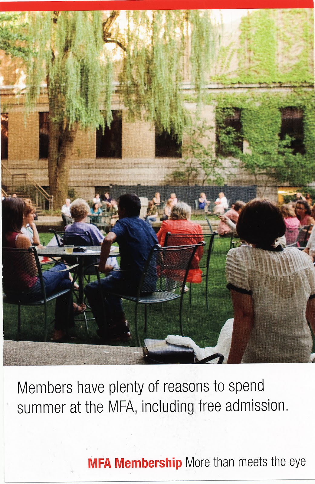
     From two different museums:


     And a local bank:


     At B Direct, we're big big fans of big big postcards. They are quick, they can be bold and brand-building. They're a great way to present a strong offer. They can utilize high-impact digital personalization (which also leads to prospect retention of the card itself). They are portable. They can be passed along. We think of them as mini posters, as little billboards delivered to your door.
     When your mailbox is filled with invoices and bills, it's nice to see some pretty pictures. The b's at B Direct are giving these marketers a thumbs-up for going old school.

Monday, July 16, 2012

Life's Little Luxuries

     These days, we get plenty of not-for-profit solicitations. And it's no wonder. When the economy is down, people have less (or perceive that they have less) to give. Sadly, when the economy is down, there are more people in need.
     Most of the direct mail we get in this category uses emotional images of impoverished families or hungry children. That's why this very straightforward #10 from Oxfam America caught us by surprise.


     The outside envelope features a two-part teaser. On the mail side, it reads: Everyone deserves life's "little luxuries" ... Then, on the back of the envelope, it continues the thought: you know ... like food, water, that kind of thing.


     This message made us stop and think before we even opened the piece. More importantly, it made us compare and contrast our own definition of "life's little luxuries" (how about a $5.00 Frappuccino, anyone?) to other more critical things we take for granted.
     Inside, the four-page letter (two two-sided sheets) started strong: Our parents were right — life isn't fair. Simple things that you and I can count on every day are luxuries to the world's most vulnerable people.


     Throughout the package, there was nary a hungry child in sight. Instead, we had elegant copy with several examples of how Oxfam America helps individuals and communities. The response slip was also straightforward with a headline that brought us back to the intriguing idea that got us to open the envelope in the first place.


     Many marketers today will tell you that long-form copy no longer works. That people don't have the time (or, let's face it, the attention span) to read this much. We would love to know how this piece did. And, what a great package to test against a similar message with colorful photography and graphics. The piece is clean, compelling, cost-efficient. And, the b's at B Direct give it a thumbs-up.